8 Keys to Landing Page Success
April 4, 2018
The creation of effective landing pages is an important part of any successful digital marketing strategy. Imagine that you have prepared your ad campaign with smart programmatic optimisation, you have created the best “copy” for your ad, you have defined a budget, your sales team is ready to receive all the records but … things are not working the way you expected. All of the energy you have devoted to getting potential customers won’t be helpful if your landing page is not ready to convert page views into customers.
Landing pages have only one objective: Convert visits into prospects.
We recommend that each product or service you offer have its own landing page. In contrast, there are many websites where the visitors are displayed all the information at once and have to guess how to best navigate the page. This doesn’t make for pleasant viewing and makes the landing page less effective.
Effective landing pages should have customer reviews and specific content, this way you can configure retargeting campaigns or personalized interactions.Whether you have a few landing pages or are about to start down this road, let us make your life easier, we know that good design can be an interesting challenge, especially if you are not a designer.
For this reason we want to share our 8 point checklist, so that you can ensure that each landing page you design is ready to achieve its objective: turn page views into potential clients.
All effective landing pages have these points in common.
1) Be Specific
We’ve all been on a website, reading something interesting … then suddenly, you get a message from a family member or friend and … you don’t go back to that article or blog post you were just reading. Or maybe you simply forget where you were. This is very common and often we don’t take this type of interaction into consideration when we are designing our landing pages. Our audiences tend to avoid reading an entire page of text, however, it is common to “scan” the screen visually until you find what you are looking for. So when you are designing your landing pages, keep it simple and concrete.
People came to your page for a reason, make sure to address that reason clearly and emphasize the value of what you offer and how it relates to the interests, needs or problems of your visitors. Use clear headings and captions, use bullet points to clearly identify what the client can get from the offer, highlight the keywords with bold or italics and keep things as brief as possible.
2) Define Your Call-To-Action
What do you want people to do when they visit your landing page? Buy, register, read more information, contact … make it very clear and place it in a visible place, that can be seen at the beginning and end of the page.

Keep in mind that your CTA (Call-To-Action) should remain on your landing page at all times, so when you urge your visitors to complete those empty fields with their information and click the “Send” button, be sure to make the process as simple as possible.
Using contrasting colors is an excellent way to get the attention of your visitors and makes it easy to complete the action you want.
Let’s take a look at the following example: Say a particular page is composed of primarily dark colors. Having the “More information” button highlighted in orange would make it almost impossible not to see. Doing this would make it very easy to know where to click to complete the action.
3) Express the Safety Signs
In relation to the previous point, it is very important for e-commerce sites to clearly express and reassure the users of their site’s security, especially when it comes to the client’s personal data as well as their credit card or other payment information. It is best if this information is conveyed through the logos of online security firms that are known worldwide. Eg. VeriSing, TrustE, etc.
A study conducted by the University of Michigan, found that with more than 1,000,000 users, the conversion rate increased by 21.7% in final sales, when it was explained to the client that all their information was going to be stored with the highest level of security.
Based on the information found in this study it is clear that clients want to know that their information is safe, before they proceed with any online purchase. This is something that needs to be solved by the design of your landing page.
Note: It is worth mentioning that in second and third world countries this safety factor plays a more important role. While in first world countries such as the United States and Europe, users who are already more accustomed to buying online, this detail has a lower degree of relevance.
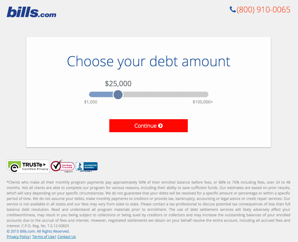
4) Maintaining Focus
Effective landing pages are simple and clear.
The more options you offer people, the longer it will take them to make a decision. We know you have a lot to tell them but … it’s just a landing page, the goal is for people to register. So, you only want to give them enough information to make a decision. If you want to give the client additional information about your company or philosophy, we recommend doing it on your website in the “About Us” section.
Another very important thing. Do you really need all the information you are asking for?
It all depends on your industry, sometimes it is better to present a question that automatically filters the people who will register, in this way neither you nor the users will waste their time.
Here’s a good example where we can see the first 4 points well implemented:
5) It’s not just about our company
Times have changed and as companies we must change with them. We are no longer the only ones who can transmit information about our service. Now users want answers from their peer reviews and from other users like themselves.
According to this changing reality, the comments, suggestions and criticisms that other clients have based on our work are equally or more valid than what we can say about our development.
The more transparent you are with our customers, the better your results and their trust in your work will be. In the previous example, we can clearly see how companies begin to interview their own users about their experience.
A good example is to build a completely new section within the company’s website, focusing specifically on the positive comments of its current users to transmit and generating this user-to-user relationship. This is with the idea of adding these comments to favour the company’s reputation.
Listening to your users will also allow you to grow based on your comments. At this point we recommend the book “The Lean Startup” by author Eric Ries, who teaches us how to build our online development from a viable minimum product which is why we should start with a landing page.
6) Avoid Visual Disasters
Placing extravagant images or gifs on your landing pages may sound like a great idea, but different tests and feedback from our community at Match2One has repeatedly showed that including these images does not necessarily help convert users to clients. In fact, they often distract visitors from the initial offer, creating friction on your page instead of making things easier.
It is true that high quality graphics draw a lot of attention but you have to keep in mind that these images are heavy and can significantly affect the loading time of your page. It is best to keep things simple and make sure that the images on your pages do not affect the visitor’s path to conversion.
7) The Format Does Matter
The “format” is probably one of the best and simplest techniques to follow when we talk about the creation of effective landing pages. Clearly formatting your headers, images, content, form, etc. help to highlight the value of your offer and to provide a good visual experience for the user. Take a look at the following example:
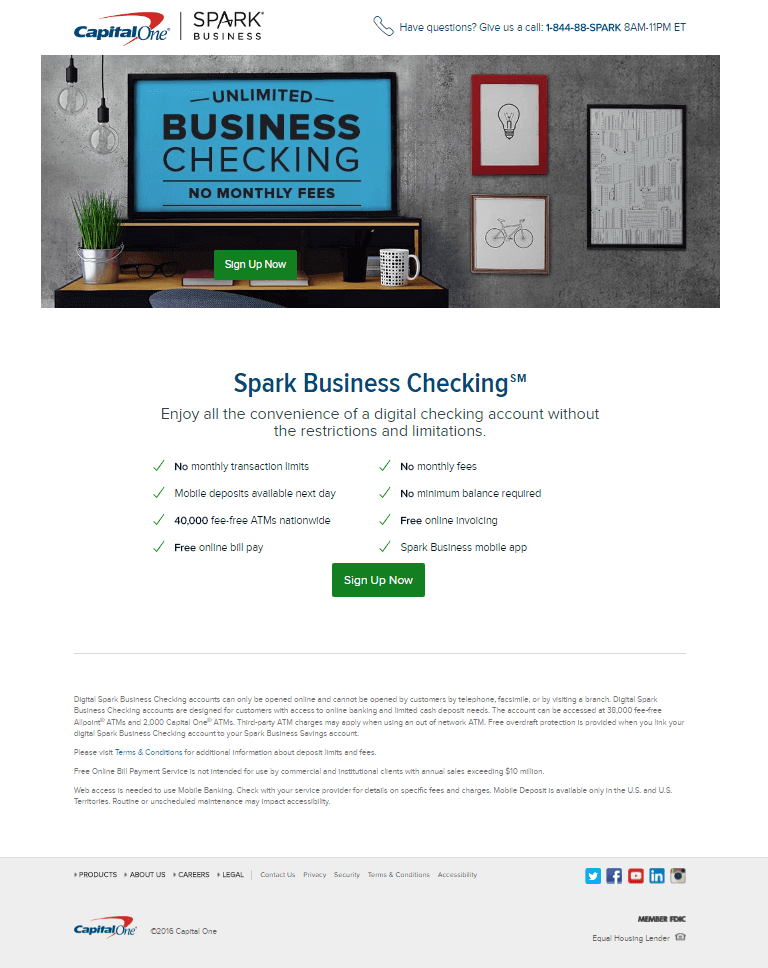
Here we can see that clear titles, added values and a fairly obvious CTA are used. The page also includes a list of relevant benefits for the ideal client (to which it is addressed) and has the contact data well accommodated at the bottom of the page.
8) The Importance of Speed
Last and but not least, is the speed with which your sales page loads. It is important to understand that neither ourselves nor anyone else will want to wait more than 35 seconds for a page to load. Based on a study conducted by Google, people will not wait more than 5 seconds for your landing page to generate a new client form.
If the landing page takes too long to load, the investment in marketing and design, is lost. We recommend to monitor page loading speed using the services of Google webmaster to measure the response time. Google will tell us precisely how long our sites takes to load. It is important not to forget speed and monitor its evolution frequently.
Regardless of how well we develop the previous points, if our website is unduly delayed to show up in front of the eyes of a potential client, we risk losing our customer and often there is nothing we can do to recover it.
Jonathan Olsson
Head of Marketing