
Banner Design: The Ultimate Guide to Create the Perfect Display Ad
November 25, 2016
So, you’ve decided to run a display advertising campaign. Great!
Problem is, you have no idea how to design your banner ads for the best results.
This article will change that.
All these banner design tips are tested by the leading advertisers in the world!
In this article, we’ll look at actionable step-by-step design guidelines that you can implement in your banners today.
There will be examples of some of the most successful banners ads that you can proudly copy and steal from – to achieve similar results as the advertising giants.
Let’s get started.

How do I create an awesome banner?
There are essentially 6 parts to each successful banner design. These are:
- The size
- The background
- The headline
- The sub-text
- The CTA (Call To Action)
- The product image
Plus a 7th part that’s often overlooked, but incredibly important:
- The Landing Page
We’ll have a look at each part, starting with banner sizes.
Which sizes of banners should I create?
According to our research, 89% of all banner ad impressions are made up of these 4 sizes:
| 300×250 Medium Rectangle, 40% of inventory |  |
| 728×90 Leaderboard – 25% of inventory |  |
| 320×50 Mobile Leaderboard – 12% |  |
| 160×600 Wide Skyscraper – 12% |  |
Mapped out, the total distribution of banner sizes looks like this:
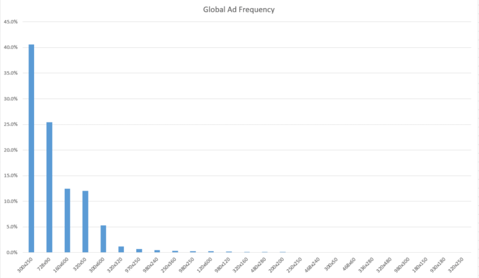
If you’re just starting out with display advertising, it could be wise to focus on these 4 most common sizes, as they’ll cover a large portion of your advertising needs.
Allright, now that you have the best banner sizes down, let’s get started with the fun stuff. The actual design.
We’ll start with the background.
2. How to choose the right background for your banners
Basically, there are 2 ways to go when picking a background for your display ads;
- The solid-color background
- The photo-background
If you want to know when to use which, keep reading.
Solid background banners
Below is a great example of a banner with a solid-color background:
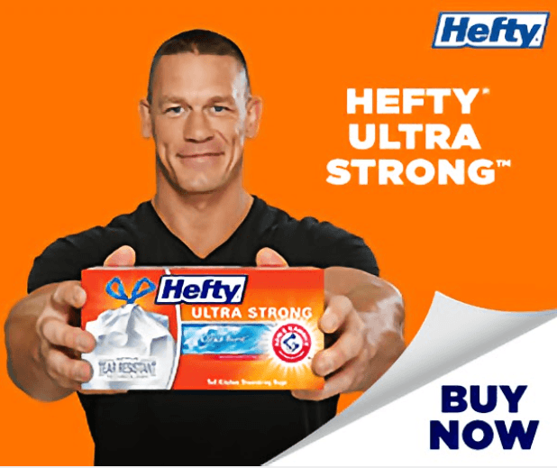
Now, you may not be able to get John Cena to appear in your banners – but there are still a few tips you could pick up from this ad:
- The solid color background enhances the message and creates a natural contrast to the white background CTA.
- There are no distractions from the headline, Hefty Ultra Strong (Or from Cena’s handsome face).
- Even though the background matches the product colors, the product photo is nicely framed by Cena’s contrasting black t-shirt.
- The white and blue Hefty logo stands out clearly against the orange background.
When should I use a solid color background for my banner ads?
If your product itself has a lot of stuff happening on it, like the Hefty box, it might be a good idea not to distract the viewer with too many other details in the background.
Also, if you have people in your ads, they usually work great against a solid color background, as does a strong slogan or product message.
The key is to get your message across, and to do it quickly without too many distractions.
Photo background banners
If you don’t have a physical product to showcase in your banners, it might be a good idea to go with a photo background, as Dell does when advertising their cloud services:

For this display ad they’ve gone with a rather messy background, but made sure their message is clearly in contrast with the background.
There are no famous people in the ad, and no actual products, so they’ve chosen to illustrate their IT transformation message with a futuristic background instead.
When should I use photo backgrounds for my banners?
- If you don’t have a physical product to showcase
- If your product is abstract and you think you can illustrate it better with an image
Generally, the main thing to consider when selecting your banner background is contrast.
You want your products to stand out enough for a viewer to clearly see them at a glance – or you want to catch the viewer’s eye with beautiful imagery before they scroll on to the next section of the page.
Have a look below:
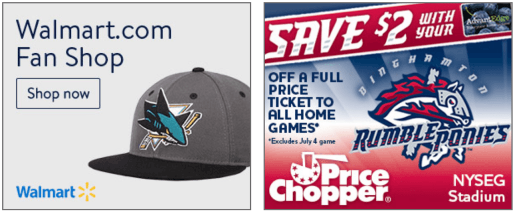
Be honest, which one of these two banner ads would you rather click?
I know I’d pick the left one every day of the week – and that’s not because I’m a particular fan of Walmart.
I don’t know about you, but I find it difficult to even read through whatever the banner on the right is trying to tell me. There’s just too much going on.
The banner on the left, on the other hand, only really has a headline and a clear CTA – which is all you need.
This takes us to the next point on our list;
The headline.
3. How to write winning headlines for your banners
Ah, Copywriting. The art of saying a lot with very little.
Often we see people trying to cram too much information into their banners – which just makes them look messy and disorganized.
Let’s have a look at some of the biggest ad spenders in the U.S:
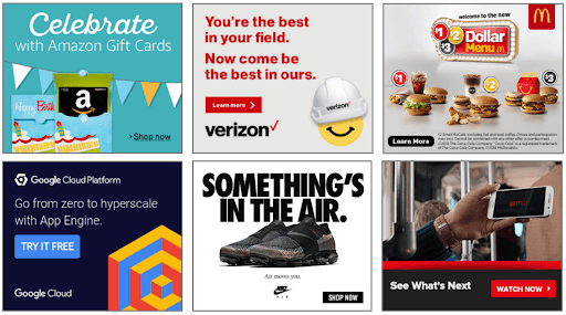
All these banners clearly communicate a message – with only one or two sentences.
Of course, these are already major brands and people know them well, but there are still some good lessons in these very successful ads;
- Keep it short and sweet. People don’t have time to stop what they’re doing to read your 5 sentence banner ad. If you can’t say it with a maximum of 2 sentences, maybe don’t say it at all.
- Be clear in your communication. Dust off the old elevator pitch and adapt it for your banners. What do you offer people, and what do you want them to do?
- Be witty – or don’t – it doesn’t seem to matter. A couple of the ads use clever slogans to lure you in (Verizon), while others just tell you straight up what they’re selling (Amazon gift cards)
- Ask people to do something. The majority of these banners contain a physical verb. These are words that implies an action, like:
- Go
- See
- Come
- Celebrate
Netflix is telling you to See what’s Next. Google wants you to Go From zero to hyperscale. Verizon would like you to Come be the best in their field.
“Construct your headlines as an action – and people are more likely to perform that action.”
Also, it’s important to note that banners are different from content.
If you write a blog article or a Facebook ad, you’d generally go with a headline like The 5 things you need to know about… or 10 secret tips to succeed with… but this isn’t necessarily the way to go with banner ads.
The main thing to remember here is time, or rather, the lack of time.
You only have a fraction of a second to catch a potential customer’s eye, so don’t waste that minuscule piece of attention on something you don’t really need to say.
This gives you a big decision to make with the next point on the list; the sub-heading.
To do or not to do? Find out next.
4. Should I use Sub-headings for my banners?
First of all, what is a sub-heading exactly?
It’s a sentence or two that goes below your main headline.
Often, people feel the need to explain their message further, and they do this by adding more text to their banners.
Let’s have a look:
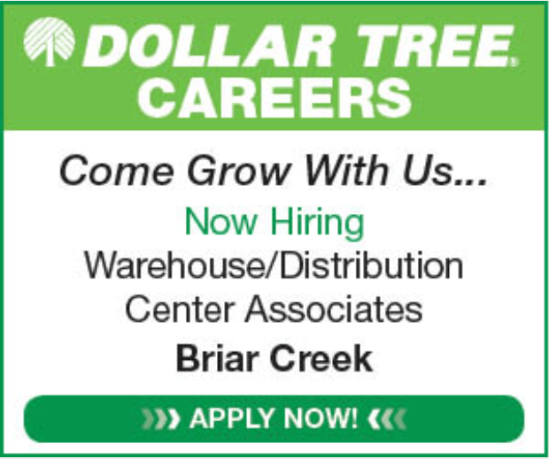
Now, you might think this is a terribly designed banner – but Dollar Tree’s entire image is built on being cheap.
If they ran a flashy animated banner with an expensive celebrity and beautiful scenery, it wouldn’t be in line with their brand identity.
With this ad, they’re targeting a specific type of person who is likely to apply for a job at one of their stores.
As for the sub-text, there really isn’t anything else going on – so the text is justified in this case.
The key takeaway from this very simple ad is;
- If you want to use sub-texts, make sure they’re clearly visible and don’t interfere with your CTA or the rest of your message.
Generally though, you’d want to avoid sub-headings in your banners unless they are very short. Like a word or two. Chances are people won’t have time to read them anyway.
It’s usually better to show people what you’re selling. Which takes us to the next category in our banner design guide; product photography.
5. Should I use photos in my banners?
Simply said, images sell.
Especially if you want people to click your ad to buy something right away.
Let’s have a look:
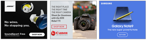
Think about it. Why would you click a banner to buy something right now if you don’t know what you’re getting?
Best practice is to let people know what they’re buying before they click.
Banner photos for digital products
Digital products do well by humanizing what they sell.
Let’s have a look at what some of the biggest SaaS companies do with their display ads:
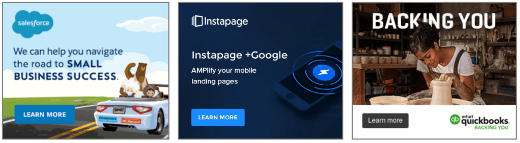
Salesforce has a cartoon-y style, well in line with the design language on the rest of their website, while Quickbooks shows a woman enjoying her work while they obviously do all the work in the background.
Instapage, on the other hand, has gone with a clear message and a picture that exemplifies what they do; amplify your mobile landing pages.
Looking at the examples above, a key takeaway is that photography isn’t always needed – but should probably be a part of your banner ads if you’re selling actual physical products.
Of course a requirement is that your products themselves look good 🙂
Pro tip: Test your ads. For all your design efforts, the truth is; you don’t really know what works until you’ve tested it.
Perhaps your customers respond better to a certain color, or one CTA performs better than the other.
Here’s an example of a test in progress:
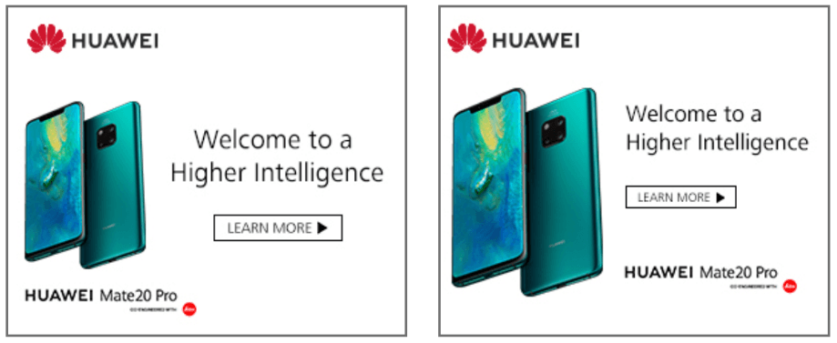
Huawei is running two ads with the same text and images, but with slightly different variations.
The trick when testing your ads is not to change too much at a time. After all, if you change both your headline and your CTA – how do you know what really made the difference?
Once you’ve settled on a background, heading and image for your banner, it’s time to get some action out of all those people looking at your beautiful ads.
You do this with a Call To Action (CTA), and if you want to know how to create a good one, you should keep reading.
6. What is a CTA and how do you make it good?
The CTA, or the Call To Action, is what tells people what to do next.
It’s a natural instinct to ask “and now what?” – and the CTA aims to answer that question.
Generally there’s two parts to a CTA;
- The color
- The text
We’ll go through both of these points, but let’s start with the color.
CTA color theory
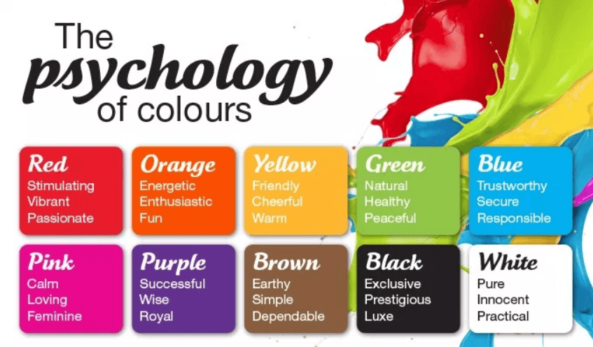
You might have read case studies of people who’ve increased their results by 100’s of percent just by changing the color of their CTA button.
These reports offer an interesting insight into the human mind; we’re conditioned to react differently to different colors.
Let’s have a look at some examples of actual banners:
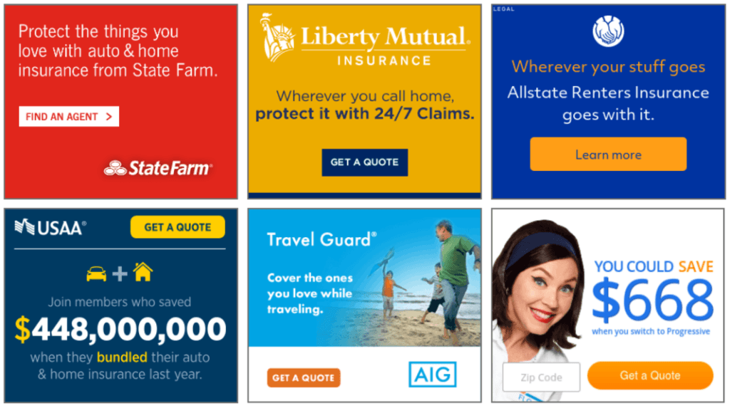
These are 6 of the biggest insurance companies in the U.S.
Now, the colors of these banners might seem random – but they’re far from it.
Here’s what the teachings of color psychology says:
Now, as an insurance company, what do you want to tell your customers?
Perhaps that you’re trustworthy, secure and responsible? In other words, blue.
With the exception of StateFarm, all the ads in the example above has elements of blue in them.
It seems StateFarm would rather be vibrant and passionate, which isn’t necessarily a bad thing for an insurance company either.
Ok, so the CTA color? What’s the secret there?
Well, have a look at this banner ad from Allstate again:

It’s got a blue background and a yellow CTA. Why yellow?
Because it’s the exact opposite of blue:
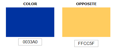
Again, with the exception of StateFarm, all the banners above use a variation of opposite-color CTA’s.
Psychologically and visually, an opposite-color CTA is the easiest to spot at a split-second glance, and it’s very easy to figure out where to click.
When creating your own ads, consider using an opposite-color CTA.
CTA Text
When deciding on the text for your CTA – ask yourself, what do you want people to do?
Here are 3 banner ads from the world’s biggest online betting and poker sites:

What do they want you to do?
- They want you to play or bet – and they want you to do it now.
What if you’re selling physical goods? What do you want people to do?
Let’s have a look:
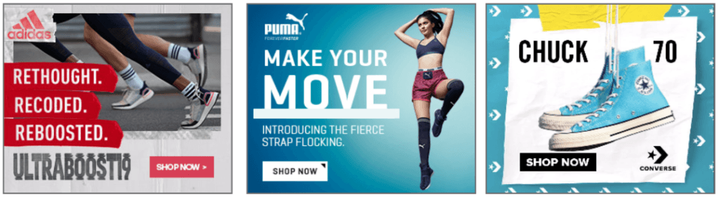
- You want people to shop – now.
And what about digital products with a longer sales cycle? Your customers might not be ready to buy your product now.
What do you want them to do?
This:

With complex products it might be better to ask people to learn more rather than to get started or sign up.
People usually want to know how you can help them specifically before they’re ready to sign up for a service – just make sure your landing page is actually a place where they can learn more about the message you’re advertising.
This naturally brings us to the bonus point on this list. Something that is often overlooked;
Where do you take people once they’ve clicked the ad?
Next up: Landing pages.
7. Why you should always have a dedicated landing page
The basic theory of landing pages is this;
When you ask people to do something – they expect to be able to do it as soon as they click the ad.
Have a look below:
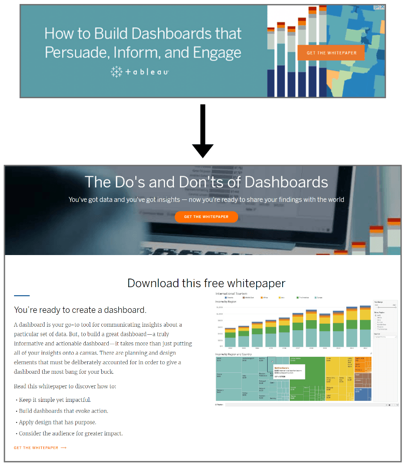
This ad by Tableu offers the viewer a whitepaper in the banner ad – and when you click it you get to a dedicated landing page for that specific white paper.
It might seem like an obvious step, but again and again we see companies that don’t use dedicated landing pages.
In fact, according to this article, only 48% of marketers build a new landing page for each campaign – yet Hubspot reports a massive 35.62% visitor-to-lead conversion rate for their dedicated landing pages.
Landing pages work because they are a natural step on the conversion path. If you only send people to your main site, chances are they won’t know what to do when they get there.
Landing page design is a whole subject on its own – and luckily Neil Patel has written an excellent guide on the subject.
I recommend reading through it before you launch your next display campaign.
Putting it all together
Hopefully, this article has given you some insights and inspiration for your future banner campaigns.
As a conclusion, here is a short checklist of things to consider when planning your campaigns:
- Banner Sizes
- If you’re just starting out, 4 sizes will cover 89% of all placements;
- 300×250 Medium Rectangle
- 728×90 Leaderboard
- 320×50 Mobile Leaderboard
- 160×600 Wide Skyscraper
2. Background
- Consider whether you should use a solid-color background or a photo background.
- Solid color is good when you want to showcase your product or have a very clear message
- Photo backgrounds can work well when you’re selling complex products or want to tell a story with imagery.
3. Headline
- Keep it short. One sentence, or maximum two, should be enough to convey your message.
4. Sub-headline
- If you need to convey further information to the viewer, this is the place to do it. Again, keep it short. It’s usually better to have a Read More-CTA than cramming your banners with text.
5. Product Image
- If you have a beautiful product, show it off!
- Crisp product images and a clear message sells products.
6. CTA
- Think about the colors. Using the opposite color of your background usually works well.
- Tell people what you want them to do:
- If you’re selling shoes – tell people to Shop Now
- If you’re selling complex digital products – tell people to Learn More
- If you’re selling online gambling – tell people to Bet Now
7. Landing Page
- Use a dedicated landing page
- You’ll see conversions improve and get happier customers if you take them where they expect to be taken when they click the banner.
Have fun creating your banners – and think about what you want to tell people, and you should be good to go!
Do you know anyone in need of some design tips? Share this article and they might buy you lunch.
Thanks

Leave a comment
Du musst angemeldet sein, um einen Kommentar abzugeben.


24 comments
Your article is an excellent resource for anyone interested in this topic. I appreciate the way you presented the information in a clear and concise manner.
Thanks for the notes I am sure what I read is going to work for me
Good Blog I really like the way you describe each point is a very informative way.
This article taught me what i did not know about banners. very self explanatory, no bogus grammar. I enjoyed reading it, i’m referring my friends right away….
I love that you mentioned that images can help you have a more successful banner. My colleague and I are looking for better ways to advertise our services, and I think that this will help us so much. I will be sure to talk to him about potentially using images with our banners, so we could get the best results.
Great info! I really like the way you describe each point in very effective and informative way.